
Welcome to the first of our Website Takedown series, where we analyse the websites of industry leaders. In November, we focused on the Travel and Hospitality, looking at TUI, Contiki, and Rentalcars.com. Our review here is based on the recent webinar you can find the recording of at ‘Website Takedown: The Travel Edition’ event takeaways. Here, we are examining the user experience (UX) across homepage, search functionality, and product detail pages.
Travel website user experience: homepage features
When landing on TUI’s homepage, a visitor is met with an array of navigation options that might feel inundating. The balance between information density and effective use of screen real estate appears to be a challenge for TUI. While the search functionality deserves some praise, offering useful tips upon interaction, there’s room for improvement in explicit guidance for users on what to input.
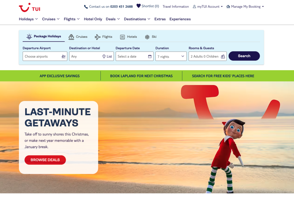
The interdependency between different search fields, such as departure airports and destinations, adds a layer of complexity. Clarifying the reasons behind certain constraints and refining the execution of interactive elements, like the obscure green banner, would enhance the overall user experience.
We would also suggest streamlining and personalising the homepage, catering to user’s specific intent, whether they are seeking information or on a discovery mission. Simplifying navigation could transform TUI’s homepage into a more user-friendly experience.
Contiki’s homepage presents a visually appealing carousel that swiftly guides users through a journey. The scrolling carousel, though dynamic, may border on distracting, and testing alternatives like static banners or subtle videos could provide a more user-friendly experience.
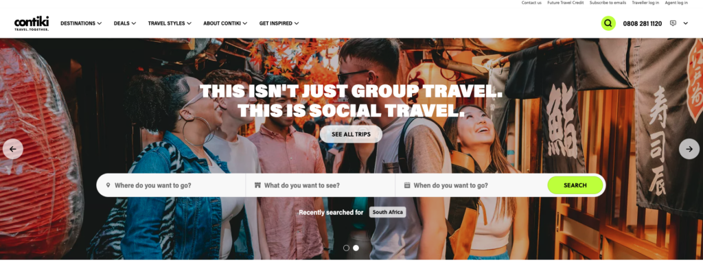
A significant positive aspect is the vibrant imagery that effectively captures the essence of Contiki’s brand. However, a potential pitfall lies in the vague articulation of their value proposition. Clearly stating their target audience (18 to 35-year-olds) at the forefront would prevent users from reaching the end of the booking process only to find age-related holiday limitations.
The unconventional search bar approach, while intriguing, might benefit from more user-centric adjustments. The terminology used and the lack of clarity in the selection process could lead to confusion, demanding a careful balance between innovation and user-friendliness.
Rentalcars.com benefits from a sleek and straightforward homepage. The use of space is great, and the interaction between currency and location options adds a layer of convenience. However, the default selection of the driver’s age (30 to 65) could be more transparent, perhaps accompanied by a tooltip for clarification.
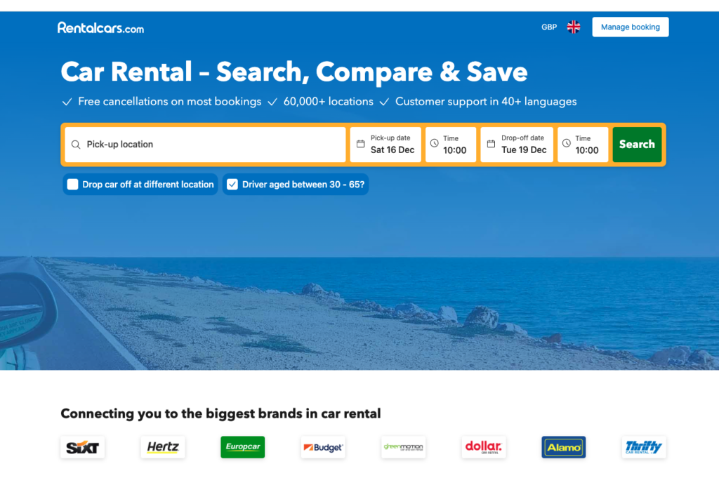
The mobile experience stands out for its focus on the search bar, remembering users’ preferences for seamless revisits. However, the prominence of the cookie banner and some nuances in the menu’s mobile adaptation might need refinement for enhanced usability.
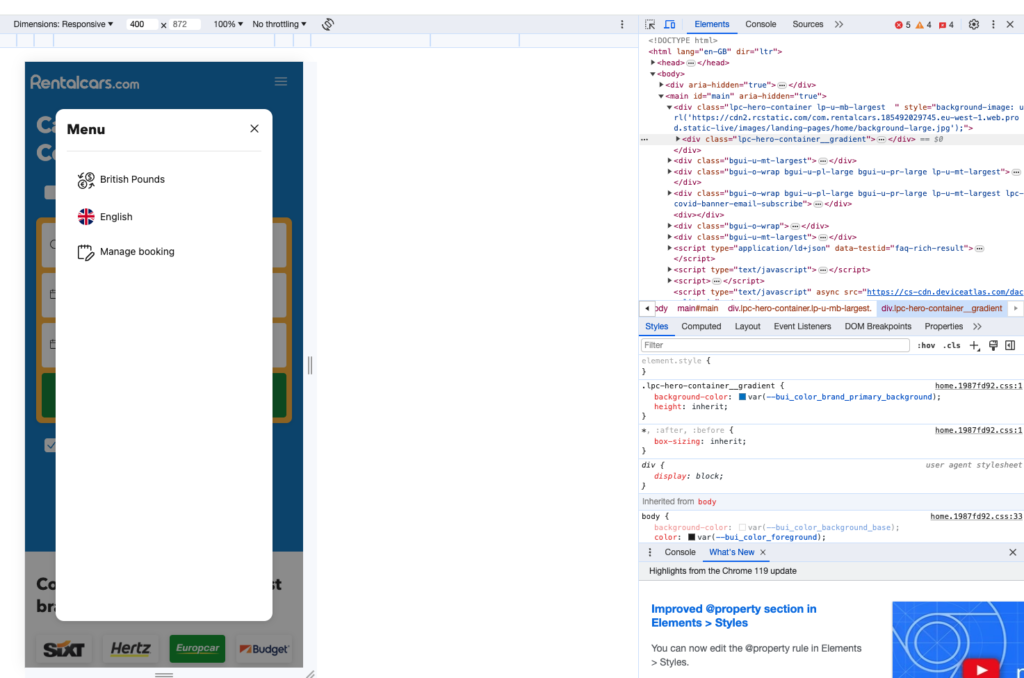
Rentalcars.com succeeds in providing a user-centric experience but could further optimise its mobile menu and capitalise on the space for additional benefits. The overarching theme across all three brands revolves around finding the delicate balance between innovation and user intuition.
Travel website user experience: search results page
Moving down the funnel with TUI, we’ve now landed on the search results page, which plays a crucial role in influencing user decisions. The focus on this page is primarily on presenting the available tour options in a clear and compelling manner.
One notable aspect is the limited number of displayed results when searching during the webinar. While this reduces decision fatigue for users, it also prompts the need for each result to be highly informative and visually appealing. The central emphasis on the price aligns with the understanding that cost is a pivotal factor for potential customers. By prominently displaying the price, TUI is acknowledging and addressing a key consideration for users.
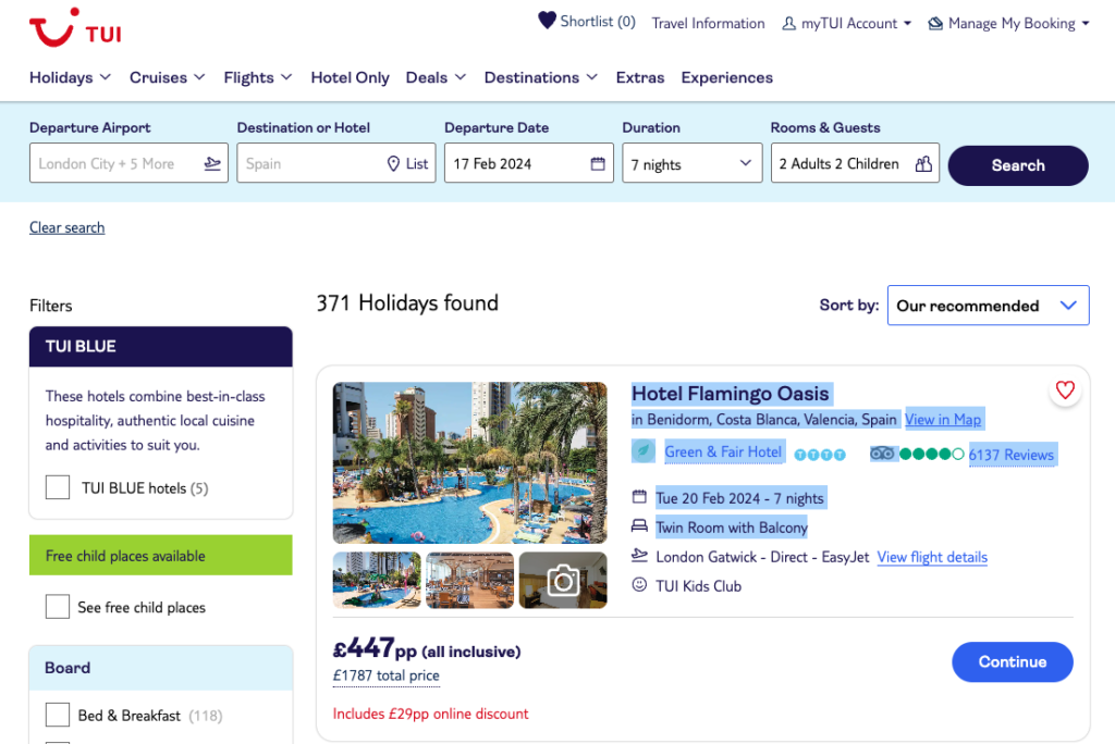
The inclusion of TripAdvisor reviews is another great feature. Reviews and ratings significantly contribute to building trust and providing social proof. Users are more likely to engage with a tour that has positive feedback from previous travellers. However, it’s important to note the small and hard-to-read text detailing key information like breakfast and flights. Optimising the presentation of such details can enhance the user experience and facilitate decision-making.
Our other suggestion is to incorporate a clear progress indicator or navigation bar on the search results page. The term “Continue” as a call to action lacks specificity and might leave users uncertain about their next steps.
Providing a visual representation of the user’s position in the funnel and guiding them towards the next stage can significantly improve the overall user experience.
Transitioning to Contiki, the search results page similarly leverages reviews and ratings to provide social proof. The use of pre-set filters carried over from the search bar streamlines the user experience, maintaining consistency in the information flow. However, the decision to somewhat conceal the filters may pose challenges, particularly for desktop users.
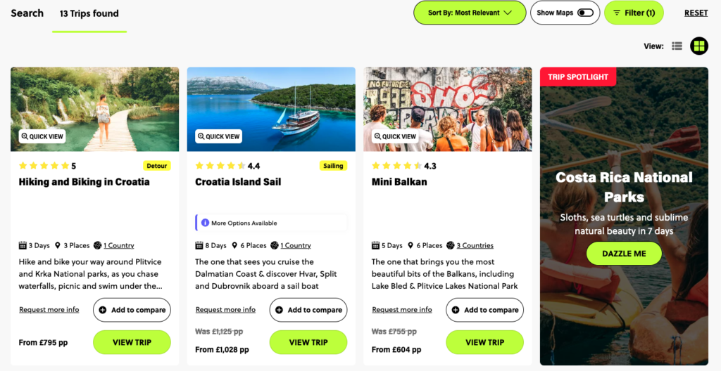
The “View maps” toggle is an interesting feature, offering users the flexibility to switch between different views. However, the busy nature of the page with plenty of images and information, requires careful consideration. Enhancements could involve refining the presentation of crucial details such as price, duration, and country, ensuring they are more prominently displayed.
Furthermore, the “More options” tag introduces an element of ambiguity, and a clearer design that provides upfront information about additional choices can benefit users. Like in TUI’s case, optimising the use of space and visual hierarchy can contribute to a more user-friendly interface.
As we delve into Rentalcars.com’s search results, the on-screen message subtly suggesting that the search is actively finding the best deals while loading results is a positive touch. The visibility of filters and sort options without requiring user interaction aligns with best practices, providing users with immediate control over their search parameters.
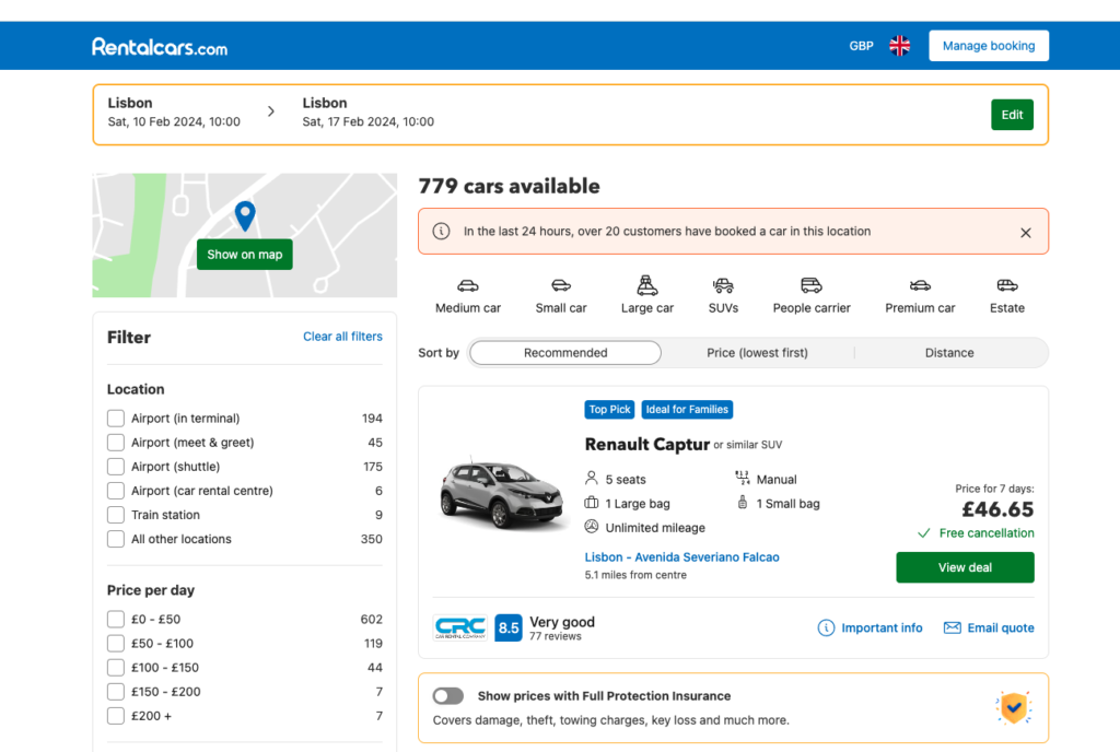
The presentation of key information, such as price and free cancellation details, is effective for building confidence. The incorporation of a “Viewed” tag for previously explored options adds a layer of user-friendly functionality, aiding in navigation.
However, potential challenge here is lack of clarity of distance information in certain scenarios. This ambiguity could be addressed through clearer labelling and contextual information, ensuring users understand it accurately.
Travel website user experience: product detail pages
Continuing the analysis, let’s shift our focus to the product detail pages of TUI and Contiki. These pages play a pivotal role in providing detailed information about the offered tours, influencing the user’s decision-making process.
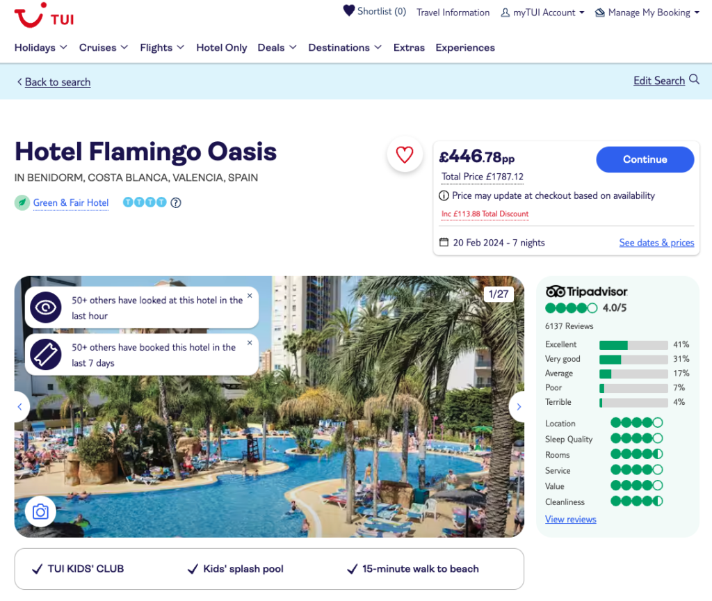
Starting with TUI’s product detail pages, the implementation of a sticky navigation on desktop is a thoughtful feature, assisting users in finding their way through lengthy content. However, the absence of this helpful tool on mobile devices, where page length can be a more significant issue, raises questions about the design decision.
Ensuring consistency in user experience across different devices is crucial for a seamless journey.
The inclusion of a map with highlighted features and attractions near the holiday destination is a helpful touch. It adds an element of exploration and helps potential travellers assess the attractiveness of the location beyond the hotel. Additionally, the presentation of quick facts about the hotel at the top of the page provides a concise summary, catering to users who prefer to quickly skim through the essential information.
On the flip side, there appears to be a potential lack of explanation to the role of the TUI rep. Clearer information about the services provided by the rep and their role in ensuring a smooth travel experience could alleviate user concerns and improve the overall understanding of this service.
Moving on to Contiki’s product detail pages, the emphasis on inspiring users with vibrant images is a positive aspect. The sticky call-to-action that remains visible during scrolling enhances user convenience and anchors them throughout their navigation of the page. Furthermore, the inclusion of prices alongside the call-to-action aids in providing immediate information.
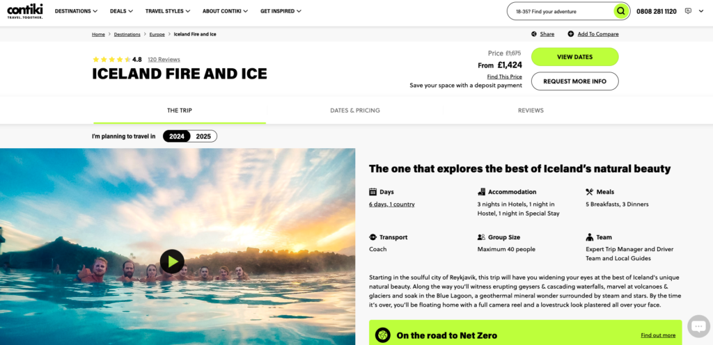
However, in our opinion, the segmentation of trip dates, pricing, and reviews into different sections may pose potential challenges to user experience. This design choice may create a disjointed experience for users, requiring them to navigate back and forth. The positioning of essential information, like the option to pay over time, could be more prominent to ensure users are aware of valuable benefits.
Additionally, extensive use of FAQs and the prominence of the net-zero information on the product detail page may be distracting users by adding potentially unnecessary clutter at this stage of decision making.
If you would like to have a more detailed account of the analysis above, watch the webinar recording available at ‘Website Takedown: The Travel Edition’ event takeaways.
If you would like to discuss how Ratio can support your Travel business with your website optimisation, get in touch with us at hello@ratiopartners.co.uk.